Lilypad
Designing for collaborative reflection in special education classrooms by real-time logging and tracking of behavioral therapy plans.
Background
Dr. Gabriela Marcu at Empathic Design & Technology had been working on Lilypad for over 5 years. The app focuses supporting teams providing behavioral and mental health services for children. The team has been working with the Drexel Autism Institute and two special-ed schools to develop and test this app. We also did a pilot program with one special-ed school in New Jersey.
Lilypad 1.0 was primarily a web-based application also used on iPads but with Lilypad 2.0 we decided to build a native app, which called for a design refresh with iOS 8 standards.
Key Changes
- Information Architecture to support flexibility
- Enhanced visual experience
- Native experience
Making the pieces fit
With most of the features already determined, a large part of 2.0 was rearranging these pieces to make the app scalable. Previous iterations were all focused on single schools, but with the response Lilypad was getting, the team decided to go for a generic solution that any school could adopt. This meant literally taking apart each of Lilypad’s elements and piecing them back together in way where certain elements could be added or removed as needed.
Home screen: before & after
Information Architecture

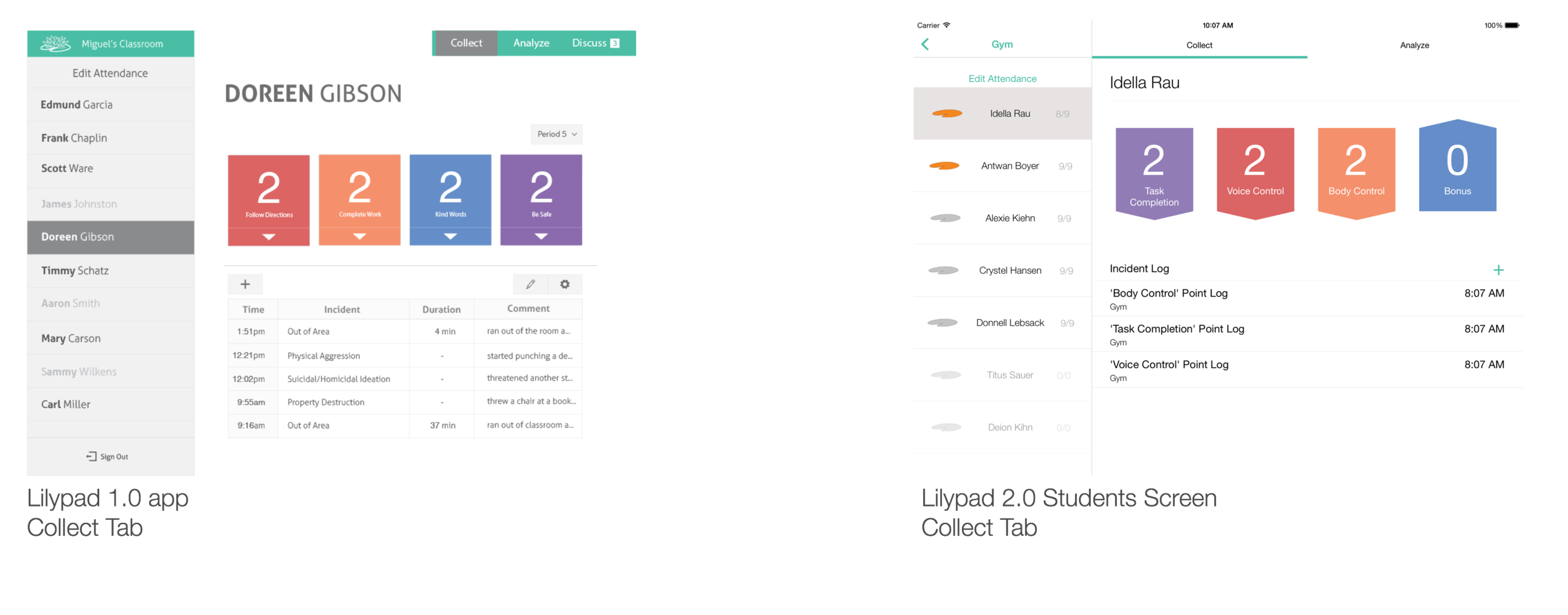
The rework of the information architecture is a highlight of Lilypad 2.0. The previous iteration was essentially a one-screen app, with logins for specific schools and an option to select classes upon login. Once a classroom was selected, the user would enter the single-screen app.
As the team was working with schools, it was found that some schools have a set of schedules that are chosen at the beginning of the day. Each schedule has a different set and order of periods. Further, it was found that aides often forget to switch between periods, so an automatic progression of periods based on time was needed. As these requirements came up, it became clear that the app would need an iOS Master/Detail View, with a navigation deck to make and switch through choices. This meant that if we were to get a school that did not use a set of schedules, that entire navigation could be removed from the deck and the navigation would continue to the period selection. In this same way, if a school just had one classroom, the app would open at a schedule selection, and so on. Newer steps could also be added to the navigation if a requirement came up in the future.
Navigation deck
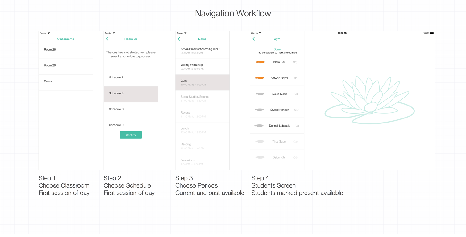
The main focus of the rework was to find a flexible, scalable solution. In addition to that, moving the previously simple left and right navigation of periods to a dedicated navigation served multiple purposes. The list allows for a visualization of the entire day, and at a quick glance, provides a status of what periods have been completed, and what the current period is. Since aides were forgetting to progress to the next period, automatic progression was implemented. This meant that the users weren’t going to need the navigation at all, and would rarely visit the list. Lastly, all data collection is pertinent to the current period, which eliminated the need for enabling frequent switching between periods.
Detail screen

Most of the elements were refreshed to adhere to the iOS8 guidelines. The previous incident log made use of a bordered web-based table, which was reorganized to the iOS list view. Eliminating the borders and labels allowed for a cleaner visual appearance. The navigation controls were also redesigned to a segmented control. Having removed the period navigation from the top of the detail view, the space could be utilized to focus on the main tabs of the application. Having iterated on the native segmented control, the final design was reached decided upon based on utilization of space. The native segmented controls are intended to be small, but with such a large space available, as well as the focus that needed to placed on the two key features of Lilypad, the wider, redesigned segmented control was decided upon.
Attendance & incident logging

The new incident modal was also refreshed to allow for multiple incident selections, a longer, scrollable list and an optional end time. Using the native time pickers and switches aims to provide a familiar, and efficient workflow to aides. For both the incident modal and the attendance list, doing away with the gray utilizes whitespace to provide a cleaner look and brings a native experience.