Dsián
(see on)
The One-Person Design Sprint: As seen on SprintStories
Design challenge, not a real product.
The prompt
Imagine a mobile app that enables you to impulsively identify and purchase a garment or accessory that you see in real life. Design an end-to-end flow covering the experience from the moment of awareness to purchase completion.
This is something that I have always wished existed, as I often find myself spotting outfits or clothing wishing I knew where to find it. As I could easily imagine myself being a user of this, I felt it would be an exciting challenge to work on.
Resources
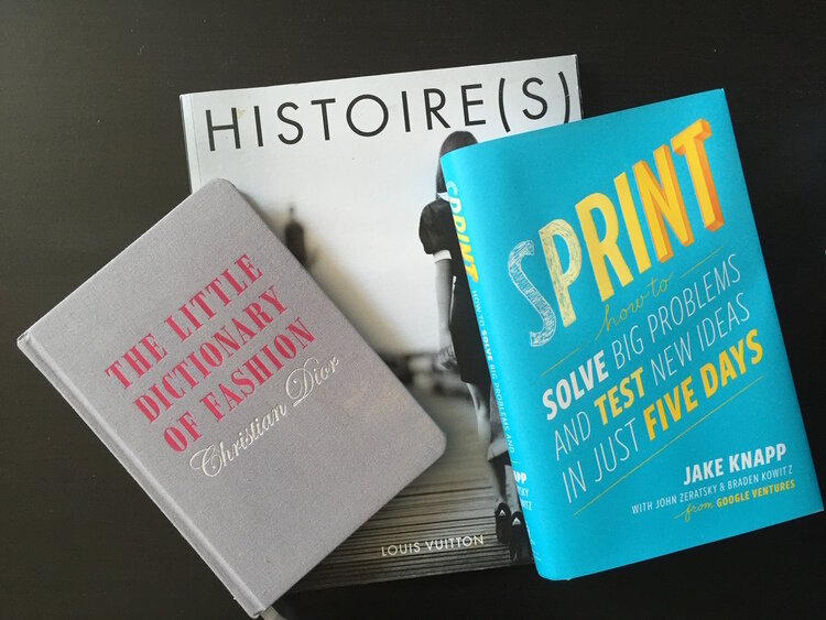
Being somewhat of a fashion aficionado myself, I started to look through my own material to draw inspiration. Revisiting The Little Dictionary of Fashion by Christian Dior and the Louis Vuitton Histoire(s) helped me get into the fashion & design mindset.
As I am currently wrapping up reading the Sprint: How to Solve Big Problems and Test New Ideas in Just Five Days by Jake Knapp from Google Ventures, I was able to apply several of the methods to this exercise. Although on a much smaller scale, with a shorter timeline, and just one team member, I used the 5-day sprint methodology to guide me through each stage of this challenge.
Early ideation

As a part of my own personal process, I usually start by finding a name for the project I am working on. It helps me internalize what the project (in this case the app) encompasses.
Disán (see-on), a mash-up inspired by French pronunciation, is a take on Design as you see it on someone in real life.
User Maps

A User of Dsián would:
Launch the app upon spotting something they wish to discover
Capture the item
Look through the matches to find the one they like
Upon finding the item, the user can either purchase the item, or save it for later
If the user hasn't already done so, they can set up credit card, address, and other information when making their first purchase
Alternatively, if the user has already made a purchase, they could launch the app to track their order
A second user map was that for a New User who would
Launch the app
Sign up with their email, set up a password, and verify the account
Set up their account information such as adding a payment method, address, etc.
Once the sign up process is complete, the user is ready to use the app, as seen in the first map
Zeroing in
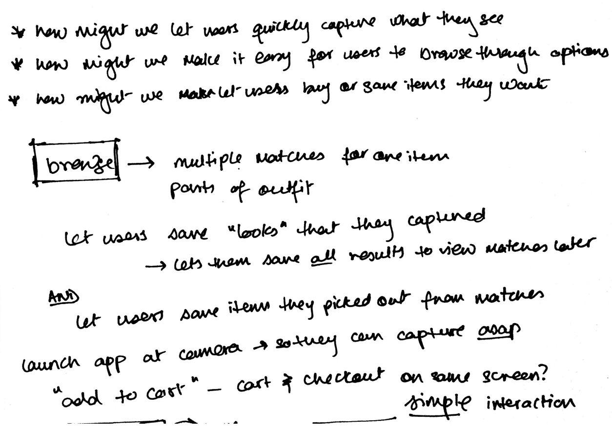
For the purposes of this challenge, I decided to tackle the first map, which is essentially the heart of Dsián - discovery and purchase. Going through the map, I started to brainstorm on what areas need the most attention, how the overall experience can be enhanced while still keeping it simple.
The key aspects to a delightful experience for such an app is largely based on
Being able to impulsively capture something that they see in real life - the point-and-click
Sifting through the options to find the one that was originally spotted
Being able to save an entire look or items to view at a later time
Inspiration

Much like the 5-day sprint suggests, I started to go through several existing apps to find great interactions that could inspire Disán's experience. This included all types of apps, not just limited to shopping or photography. Examples, as seen above, include travel apps like Expedia and Airbnb, an oddball - Tinder, and others like Google Inbox's swipe interaction, Snapchat's camera-on-launch idea, and Robinhood's swipe to send order for stocks.
What I liked best about the travel apps was the focus on discovery given a multitude of options. In Airbnb's app, having the option to book once the user is in the context (of the listing) is great, but devoting sizable real estate of the screen close to the action areas is what stood out most.
Having been a user of Robinhood, I have had a love-hate relationship with the swipe to purchase interaction. A smooth, fun interaction often makes me forget that I am actually spending money and taking a risk. While maybe not the greatest idea for stocks where users risk losing value, I thought it might be less harmful to use it in the context of shopping.
Left: Design inspirations (aka lightening demos). (L-R) Row 1 - Google Inbox's Swipe interaction, Tinder's Swipe interaction and Card Stacks, Expedia's Expandable Cards; Row 2 - Robinhood's Swipe Up to Send interaction, Airbnb's Static Bottom Bar/Call to Action, Amazon's Static Bottom Bar and Drag to Add interaction; Row 3 - Snapchat's Camera on Launch
Crazy 8’s
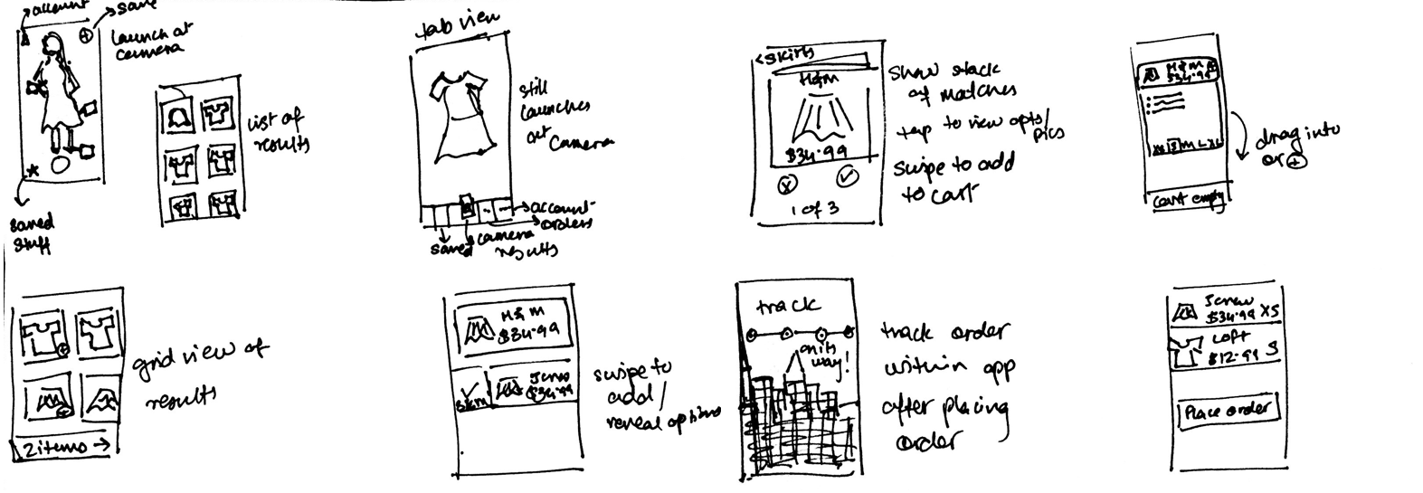
Again, based on the 5-day sprint technique, once I had all my inspirations down and narrowed down on the flow I wanted to design for, I spent 8 minutes hashing out 8 different variations/ideas for Dsián screens, after which I was able to decide which ones stuck out the most.
Solution in low-fidelity


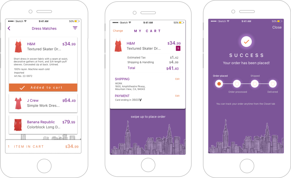
Visuals in high fidelity